SmartAngels
Started in 2015, with a pivot from Photoshop to Sketch.
Created on Sketch, shared with developers on Avocode, public website (since down)
Created on Sketch, shared with developers on Avocode, public website (since down)
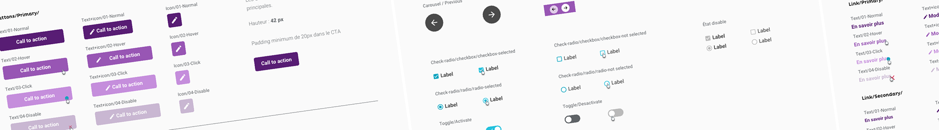
Using Sketch, and even before the internet was flooded with articles on design systems, I created a library for our design team to make our work easier and ensure consistency of elements across pages. We quickly realized that creating an equivalent on the tech side to facilitate development and ensure harmonization of the site was more than necessary. The design system was born.
Special feature: this design system simultaneously presents the elements of the Business and Investor sections, each with a different graphic charter and functionalities.
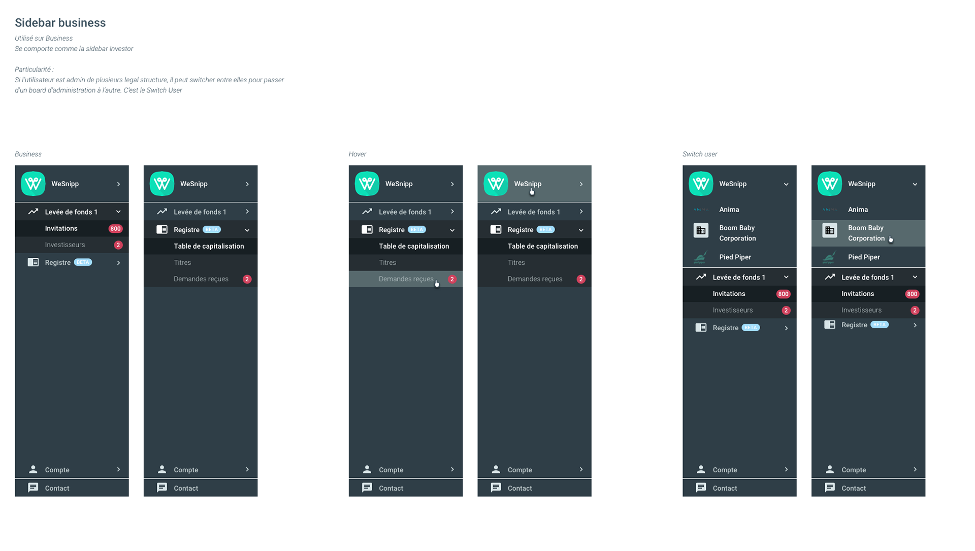
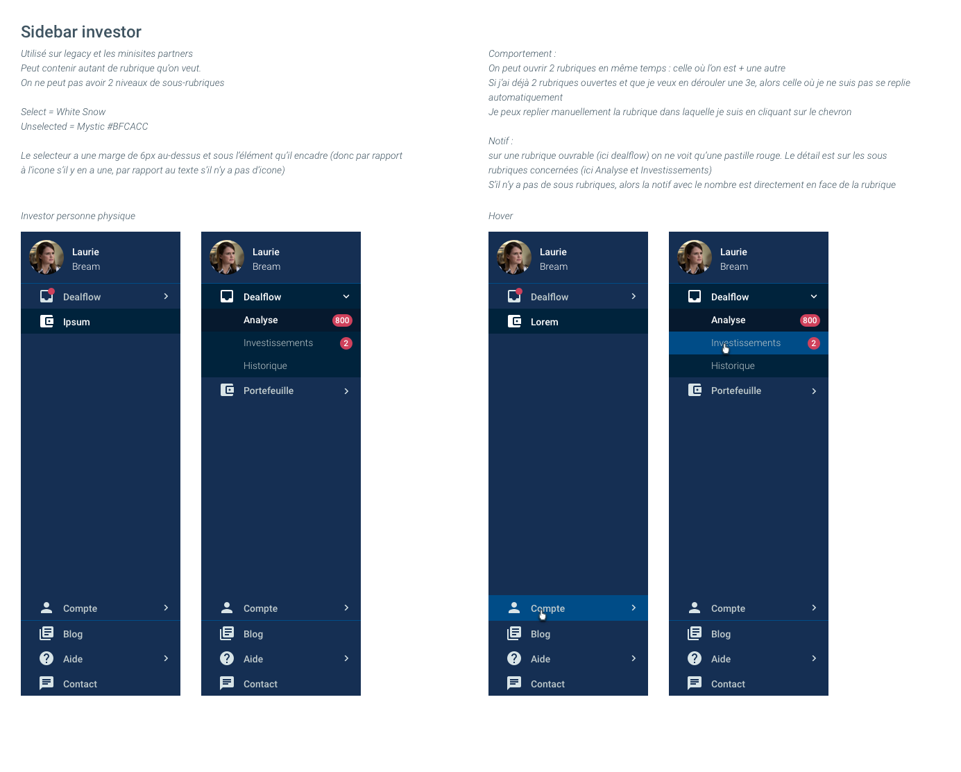
Sidebars
Saver space - website (Natixis Interépargne)
Started in 2018. Created on Sketch, shared with the developers on Invision, and published on a private website.
The saver space was in the early stages of its redesign. To make it easier for both designers and developers, we decided to implement a design system.
Special feature: the ability to call different datasets to see how an element behaves in different situations.
Saver space -app (Natixis Interépargne)
Initially based on the web design system, the app's one quickly detached itself from its parent: brighter and more modern colors on the app, font sizes, app-specific elements, illustrations, etc.
Extract of the app's design system
Subscription tool - easiris (Natixis Interépargne)
2019, Création sur Sketch, partage avec les dev sur Invision, et site web privé
L'outil de souscription a la particularité d'avoir plusieurs chartes graphiques selon les partenaires. J'ai profité du changement de techno (JS vers Angular) pour pousser l'idée du design system auprès des devs : ils allaient gagner du temps et pourraient gérer des tableaux de correspondances entre les partenaires. Ce design system a été monté très rapidement et a prouvé sa valeur auprès des équipes.
Particularité : multi-chartes, un seul composant peut avoir 4 affichages différents selon le paramètre "partenaire" appelé par la page. Le design system est pensé de manière à pouvoir ajouter d'autres "partenaires" par la suite, donc d'autres chartes, et que les éléments s'adaptent directement grâce aux tables de correspondance.
2019, Creation on Sketch, shared with developers on Invision, and private website.
The subscription tool has the particularity of having several brandings depending on partners. I took advantage of a technology switch (JS to Angular) to push the idea of a design system to the developers: they would save time and could manage matching tables between partners. This design system was set up very quickly and has proven its value to the teams.
Special feature: multi-branding support, a single component can have several displays depending on the "partner" parameter called by the page. The design system is build to handle new partner's branding easily and to save a lot of tech time.
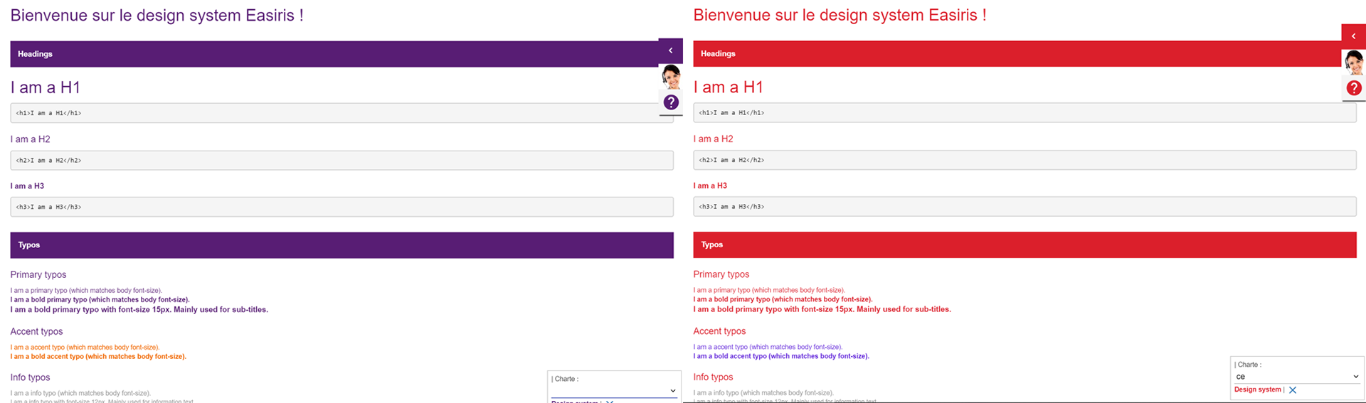
Design system easiris : default view and Caisse d'épargne's view
More than a UI kit
Often mistaken, design systems and UI kits are very different. They both present elements needed to create an interface. However, UI kits are intended solely for designers, whereas design systems are aimed at both designers and developers. It is a library that, unlike design systems, does not detail the specs of the elements it contains. A design system includes:
• Element specifications such as dimensions, padding, colors, behaviors (active, hover, click, disable, focus, etc.)
• Use cases/display conditions
• A library that can be used in design software (Sketch, Figma, XD, etc.) AND a library that can be used directly by the tech team
• An online view of the "dev library" that offers several features such as viewing the source code, the ability to copy this code, or find the name of the component to call in the code. These features can be enhanced.
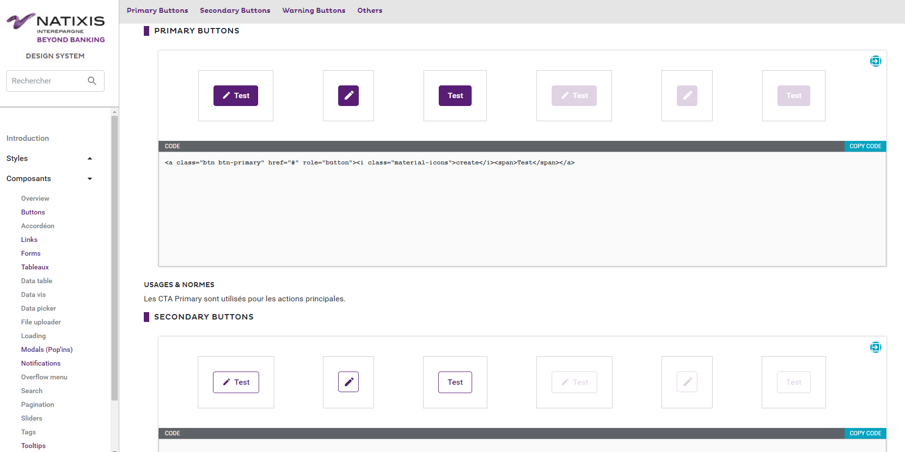
Design system NIE web, tech version
At the beginning
A design system is a long project to launch. Implementing it can take several months depending on the scope of the project and at which stage it's created. It requires time from both designers and developers: all recurring elements must be listed, standardized if necessary, categorized, use cases explained, and elements coded. In some cases, a rework may be necessary to implement the new design system components in place of the old ones. This can be done gradually as redesigns are carried out.
The initial investment in time and resources is therefore quite substantial, but it pays off over time.
Building a design system requires the involvement of the whole team—designers, developers, product managers, and product owners. It’s not just a designer’s job; components must be coded and used consistently by developers. Everyone needs to invest time and effort, balancing this work with existing roadmaps and planned releases.
Clear and shared naming conventions are key. Designers and developers must align on terminology to ensure smooth communication and efficient use of the system.
A well-maintained design system can speed up front-end development by up to three times. At SmartAngels, for example, one front-end developer acted as the design system lead, reviewing new designs ahead of each sprint to prepare necessary updates—helping the whole team start with everything ready.
Conclusion
Design systems not only improve speed and consistency but also strengthen collaboration. By creating a shared tool and language, teams work more closely together, beyond just building a product—they build it better, together.