Company : SmartAngels
Sector : fintech, B2C, B2B
Support : website and back-office
Role : facilitation, design workflows and interfaces
Sector : fintech, B2C, B2B
Support : website and back-office
Role : facilitation, design workflows and interfaces
Scope
• Mentored and trained junior UX-UI designers (apprentices)
• Managed the full product lifecycle: from initial brief to delivery
• Actively supported tech team through co-design workshops, continuous collaboration, and QA testing
• Design system owner
• Managed the full product lifecycle: from initial brief to delivery
• Actively supported tech team through co-design workshops, continuous collaboration, and QA testing
• Design system owner
Context
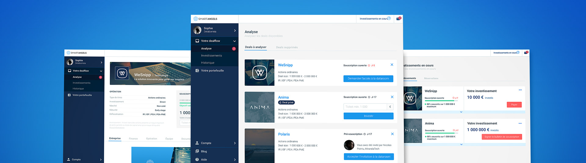
My initial mission focused on optimizing every aspect of the fundraising activity, across three platforms:
• B2C platform showcasing live and upcoming fundraising opportunities to potential investors
• B2B platform for businesses to manage their fundraising operations
• Internal back-office tool for our operational teams
• B2C platform showcasing live and upcoming fundraising opportunities to potential investors
• B2B platform for businesses to manage their fundraising operations
• Internal back-office tool for our operational teams
Thanks to the company's growing expertise, we later expanded into new verticals:
• Portfolio management, allowing investors to track their investments
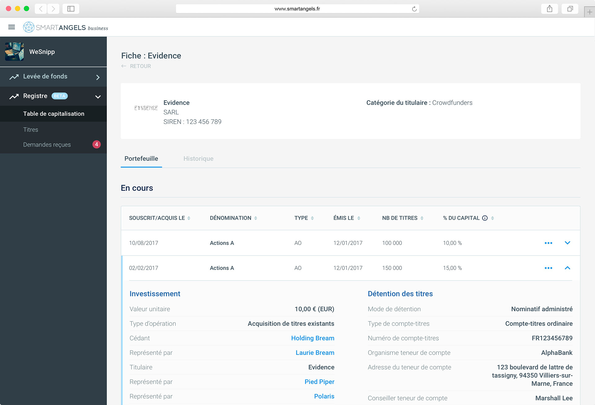
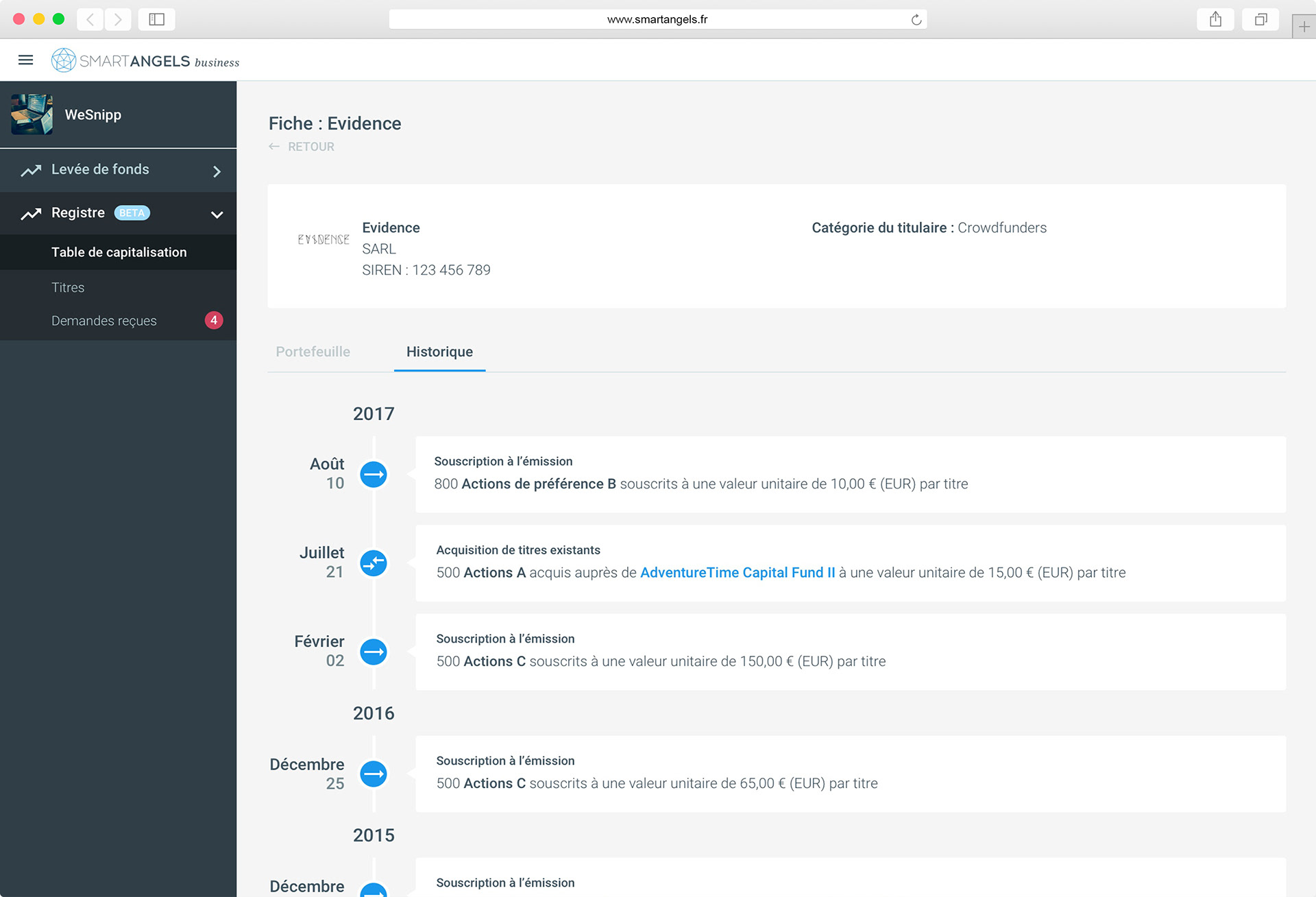
• Securities registry, enabling businesses to monitor the flow of financial instruments and capital
• Portfolio management, allowing investors to track their investments
• Securities registry, enabling businesses to monitor the flow of financial instruments and capital
I had the opportunity to design these two new platforms from scratch, working closely with experts in a series of collaborative workshops. This involved deep product thinking, UX research, user flow mapping, and high-fidelity interface design—all aligned with business goals and user needs. The following is a description of how they were built.
Applied Methodology
To build a clear, step-by-step vision for each product version, I led a card sorting workshop with stakeholders. In this case, we worked simultaneously on the Securities Registry and Portfolio Management platforms, since their features were tightly interconnected—even though their users and needs were quite different.
During the session, we identified functionalities based on insights gathered from user interviews (represented by yellow post-its for the registry, and green for the portfolio). We grouped them by themes (pink post-its), such as “Capitalization Table” for the registry or “Securities Management” for the portfolio. Then we prioritized features into release versions, balancing user value with technical feasibility.
This gave us a strong foundation to move on to journey design and wireframing.
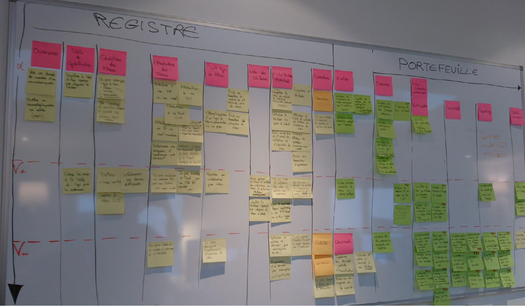
Card sorting workshop
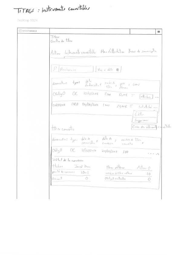
Wireframing approach: paper first
To quickly explore ideas and iterate without constraints, I prefer starting with hand-drawn wireframes. Unlike digital tools, paper allows faster sketching and less attachment to layout perfection—which encourages creative risk-taking and aligns with the “fail early, fail often” mindset.
Paper wireframes also maintain a low-fidelity level, leaving more room for flexibility in the upcoming UI phase, and making early feedback more focused on structure and logic than visual polish.
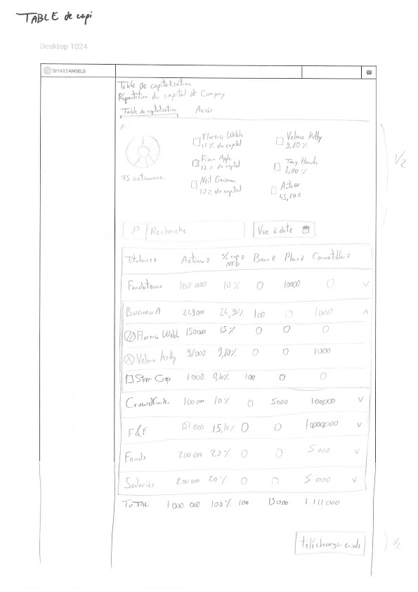
Wireframe of the main page of registry
Wireframe of the portfolio
Designing two interconnected platforms
Designing the registry and portfolio platforms simultaneously was a rich and complex challenge. Each product addressed a wide and diverse user base:
• From beginner investors to professional asset managers on the portfolio side
• From startups to large corporate clients managing digital registries on the registry side
• From beginner investors to professional asset managers on the portfolio side
• From startups to large corporate clients managing digital registries on the registry side
Some users—particularly asset management firms—played a dual role: they were both companies (issuing securities) and investors (holding assets as legal entities), which added another layer of complexity to the UX.
Because many features in one platform impacted the other, we needed to build them in parallel. The card sorting workshop mentioned earlier was key in visually mapping cross-platform dependencies and aligning development priorities.